I've had many requests for a list of the colors I use most often in my watercolor practice and what colors I'd recommend for beginner painters. Being a color-lover/collector, it was a challenge for me to narrow down my list, but looking back at my work over the past few years I can see a pattern in my color choices. I'll now share my thoughts and observations with you.
All artists have their go-to basics and add a few personal favorites that might define their unique style. The classical palette is often limited to double-primary hues, each color having a warm and a cool temperature aspect, plus a dark earth tone such as Burnt Umber. Using only a double-primary palette, it's possible to create limitless color variations and, in the process, learn much about color theory, too. However, without some prior knowledge and experience, there's also a good likelihood that the results would turn out to be a muddy mess! So, in addition to those, I've come to choose colors from the second list to get the results I'm looking for in a particular painting.
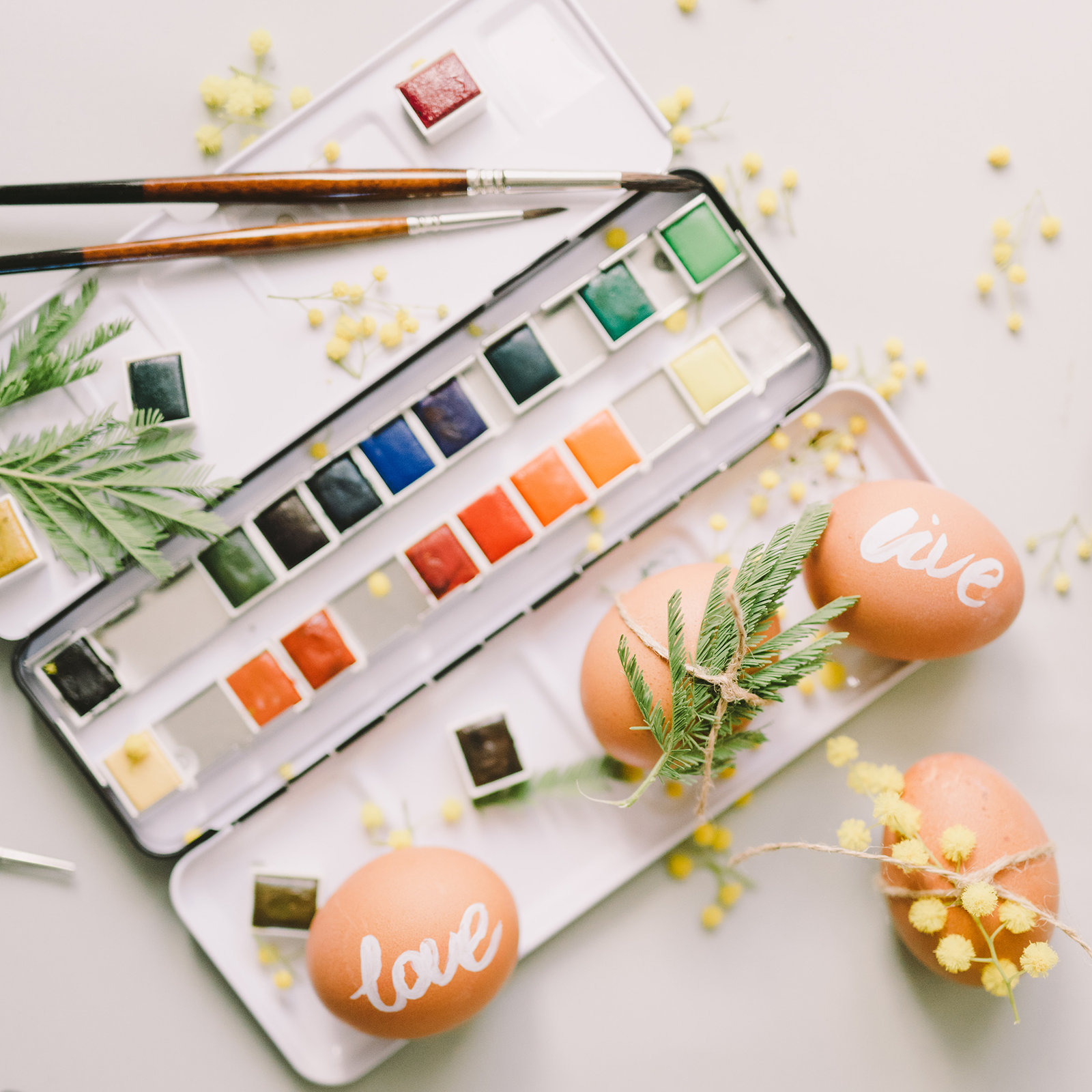
The colors listed below are by Daniel Smith unless otherwise noted.
| PRIMARY COLOR | WARM HUES | COOL HUES | NOTES |
| Yellow | (Cad. or Hansa) Yellow Medium | (Cad. or Hansa) Yellow Light | |
| Red |
Cadmium Red Light Mayan Red |
Permanent Red (or Cad. Red Medium), Permanent Rose | |
| Blue | Ultramarine | Cerulean and Cobalt | Ultramarine and Cerulean Blue Deep by Da Vinci |
| Neutral (Earth) | Burnt Sienna and Raw Sienna | Burnt Umber, Raw Umber |
In addition to those nine primary colors, I frequently use the following:
| COLOR NAME | WARM | COOL | TRANS | NOTES |
| Yellow Ochre (Earth) | X | T | low intensity yellow | |
| Naples Yellow | X | ST | low intensity yellow | |
| Aureolin | X | T | cobalt yellow | |
| Burnt Sienna Deep (Earth)* | X | ST | Da Vinci | |
| Permanent Rose (Rose Madder) | X | T | quinacridone rose | |
| Permanent Alizarin Crimson | X | T | ||
| Hooker's Green Deep* | X | ST | color varies by brand | |
| Sap Green* | X | T | color varies by brand. I prefer Daniel Smith. | |
| Deep Sap Green | ||||
| Prussian Blue | X | T | granulation | |
| Payne's Blue Gray* | X | ST | by D. Smith - no granulation | |
| Imperial Purple | X | ST | high granulation, Duo-Tone color by D. Smith | |
| Pyrrol Orange | X | ST | Cadmium Orange is similiar | |
| White (Chinese White or White Gouache) | ST | Gouache is an opaque watercolor |
With infinite colors to behold in our beautiful world, why limit ourselves to a dozen or two? Explore the possibilities! Play with your palette! Enjoy the process!